Portfolio: Color Theory & Rendering(GDD1,3rd, SY011-012)
Instructor: Martin P. De Mesa
Student: Erin IT Yap (11150149)
2012 BS-IT
Monday, April 2, 2012
Sixth Plate: SUBJECTIVE COLOR
 |
| Plate Six: Using Acrylic Paint. |
"Instructions:
1. Sketch the image from your photo reference using pencil.
2. Paint the subject in a realistic manner (at most) using acrylic paint on a 15 x 20 coldpress illustration board. (*Please maximize the whole space!)
3. However, you must "ALTER" the usual color of the subject, by which your rendered output will have an impact to our visual perception. Ex. Pink eggplant."
I was assigned french fries! When I checked what everyone else had I could only think one thought. Sir was hungry. I really wanted to draw just one fry but french fries was plural so I drew more that two to meet the requirement. My picture had a purple plate with yellow fries and red ketchup, so I inverted the colors into their complementary half. From red to green, yellow to purple, and purple to yellow.
Fifth Plate: AFTER IMAGE
 |
| Plate Five: Using Acrylic Paint. |
Fourth Plate: ADVANCING AND RECEDING COLORS IN RELIEF PLANAR GROUNDS
 |
| Plate Four: Using Acrylic Paint, and Styrofoam. |
The fourth plate was not as easy as all the other plate, in fact i think it is the most difficult. Difficult not because of the instructions but because of how it was explained. Instructions: using Styrofoam board or illustration board and cool to warm color schemes create an effect of deepening/falling. I used blue and orange acrylic paint. This was not( and no where near) my favorite plates. Unlike my fellow classmates I finished this plate the day it was given.
Third Plate: MASK DESIGN - EXPRESSING EMOTION IN COMPLEMENTARY COLOR HARMONY
 |
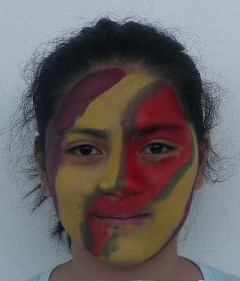
| No this is not a mug shot of a girl named Excitement. |
 |
| Plate Three: Using Face Paint. |
Plate three how exciting! The instructions for this face plate was simple but rather challenging. Challenge: Paint the emotion assigned to you on your partner's face using face paint and complementary colors only. CHALLENGE ACCEPTED! I was assigned the emotion of excitement so I grabbed two friends to play pass a partner. First we designed the plate on paper and selected the necessary color combinations. The friend(A) who painted my face used blue, orange and white to express the emotion of calmness. On her(Friend A) face my plate(Friend T) painted the emotion of fear using black, yellow, violet, red, and green. I wanted to show my excitement through a war paint and bright design, so I used red, green, violet, and yellow. I tried not to use much of the darker colors because excitement was a bright and energetic emotion.
Second Plate: ABSTRACT COMPOSITION IN COMPLEMENTARY COLOR HARMONY
 |
| Plate Two: Using Acrylic Paint. |
First Plate: OPAQUE, WASHED, AND SKETCHY
 |
Plate One: Using coloring pencils, water color paint, and poster paint. |
The first class and plate after an overly extended break. There isn't much to say about this work, because it was the first and one of the most simple plates. The instruction was to simply draw shapes found in the classroom and paint them using only the primary colors as the base and poster paint, water color paint, acrylic paint, or coloring pencils as the mediums. This exercise was meant to show the difference(in looks and in usage) when using each of the mediums. I had a stress ball with me that day so I drew it twice. Both balls I colored with coloring pencil which doubled as a water colored paint. On one of the walls of the room I spotted a triangle drawn with what looked like a marker. this I also drew twice, but I tweaked one so it would be different from the other. I used my blue and red water color paints to make one violet-red. As for the other I painted it dark blue with poster paint. CSB being in a Christian college meant there was bound to be a cross in the room. The cross was found hanging on the wall opposite the doors. I used water color, poster paint, and coloring pencils to color this simplified version of the cross. The four quads I made came from the white board, the table, the face of a wristwatch, and the rim of my glasses.
Subscribe to:
Comments (Atom)
